Old things no longer in service. While it hasn't been planned, I do this around every six months for the blog and major changes to structuring.
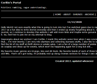
I've been here awhile, off and on. This being the longest stretch I have been active for. This will be a sort of layout archive and overview of the thoughts or memories of them.
The best way to describe this period is "simple". The focus was on just seeing what I could do in theory, planning projects and things based on what I could figure out.
I had not a clue what I wanted and just thought a website would be neat to have. I previously was on yola at or around 2010, tried wix but I wanted to mess with HTML so it wasn't for me.
I didn't blog and I only made layouts. Not a very interesting time.
I'd returned to focusing on HTML and this time using some CSS...
Most of this stage still lingers in small ways, the styling is only additions to what was in place at this stage. Dark backgrounds, white text, yellow links.
The experimental stage for what I would want to write, then working on layouts again. Basis for shrines in one giant page, divs, iframes. Every tag I was willing to try. Song of the Day, Sidebars, layering.
I never saved a backup of the final stages of this layout and it wasn't simple enough to recreate.
UPDATE: It appears this version of the site was put on the wayback machine. I have tweaked it to better fit how it looked at the time and it's only missing two major graphics.
Originally the website had a different url and I forgot to check that.
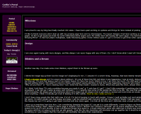
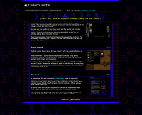
The purple and violet color scheme was created. Castlevania sprites were everywhere. Three divs, buttons on the main screen. Perfect for starting but too simple for what I wanted.
The design was cool and the purple and violet swapped spots to appear brighter. The general size of this layout carried over into the late stages of the Orange Era as it got more refined.
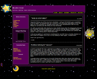
It featured a ton of Kirby graphics as that was the shrine focus at the time. I usually match the focused shrine page with the layout or experiment with concepts I draw and try to fully realize it.
This one was too specific in the wrong spots and the navbar got crowded. Which would be addressed in the first orange layout, by making the navbar massive. Then in the final stages, it was condened back to this size by including a drop down menu for shrines.
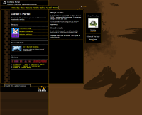
The orange layout was huge, had background images and two navbars. I called it two names, Trident and Gridbox. I wanted less places to go and more links on screen at once but it was too big for my liking.
The anniversary layout also celebrated my first complete year doing this. The anniversary layout was just a version 3 of that. For a time both felt like my home on the web. Until it wasn't.
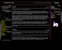
This lasted the longest of the publically viewable layouts. It's color scheme picked for the purpose of eye strain at night, it got carried over to the next layout.
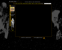
The final orange heavy layout for now. Messing with the quantize feature of paint.net; Previously you had to just save it compressed to get similar results.
The button made it easier to just compress and continue doing things immediately instead of compress-open-compress. Heavily using absolutes, starwars stock images and sepia tone.
I used every feature, couldn't recreate the steps because I didn't record them because I forgot. The amount of steps to make it look this way for everything could not be maintained. Also it shifted the focus in a lame way to the design itself instead of the pages.
The grand reset to mess with ideas. I occasionally will need this, I made it a rule for awhile to avoid blue so this was me just saying to myself to not set things like that. The color blue is comforting. This one feels very funky to me.
I also had this blue dude on some pages, the idea for it is pretty clear. Works as a mascot. Wanted one, got attached to the placeholder blue dude. The concept was made very quickly and was called spiderwebs, I thought blue mode was a funnier name.
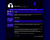
The current theme, extension of blue mode and webdesign stuff I like to look at. Still in blue.
Really embracing the blue, more use of css. I believe that this is the peak of style options for what I want to do.